Buttons

There are several approaches to creating buttons using different tags (<a>, <button>, <input>). Functionalities are different by tag; but by customizing CSS, you can achieve the same style regardless of your tag choices.
1. Buttons with the <a> tag
Using the <a> tag is the simplest approach to creating a button. This approach can be used when you want to create a button to add a link to another page; however, you cannot use this approach for the button used to submit form data. As the <a> tag has an end tag, you can insert an icon into the button design.
Syntax
You can use the syntax below. Add a class for the button styling. You can use any class name. "btn" is often used for the button class name. To open the link in a different tab, you can also add the target="_blank" attribute.

Styling
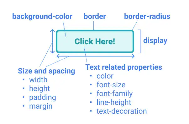
To style a button, you need to define many properties:
- For background and border design
background-colorborder(style, width, color)border-radius
- For text design
colorfont-sizefont-familyline-heighttext-decoration)
- For size, spacing, and layout
heightwidthpaddingmargindisplay(including related properties)

You can decide background-color, border and border-radius flexibly based on your design choice; however, you may need to carefully manage text, size, spacing, and layout-related properties as they are important to organize the button design structure.
Text related property
color, font-size and font-family are straightfo
Subscribe now for
uninterrupted access.