Cards

Styling cards look complicated but creating them is not difficult once you understand the structure of HTML elements and CSS key properties. As you can quickly implement well-styled card components using CSS libraries such as Bootstrap, you can skip this lesson; however, mastering card styling can help improve your design flexibility skills.
In this lesson, we'll explain how to create and style cards with case examples.
Case 1: Card with an image and button
This is the target design for this case example.

First, you need to structure the elements of the card using HTML. There are three layers, and you need to assign classes to manage each layer.
- 1st layer: The card itself using the
cardclass - 2nd layer: The image and the body of the card using the
card-imgandcard-bodyclasses - 3rd layer (under the card body part): The card title and button using
card-titleandcard-btnclasses
Here is the HTML example code. For layout and visibility purposes, we are directly adding the display and background-color properties to the parent element in the HTML code. Also, we are making the parent element Flex Box, so we can to coordinate positions of multiple cards later on.
<div style="display: flex; background-color: azure;">
  <div class="card">
    <div class="card-img"></div>
    <div class="card-body">
      <div class="card-title"><small>Todays's Pick</small></br><b>Green Salad</b></div>
      <a href="#" class="card-btn">Open Recipe</a>
    </div>
  </div>
</div>
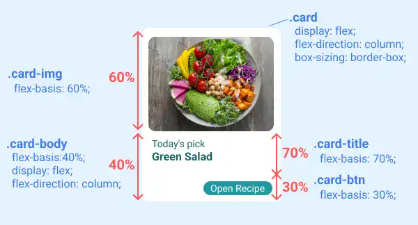
After having written the HTML code, you need to add CSS properties to each class. The most important part is handling element layout. The Flex Box approach is utilized to manage the element layout. Using flex-direction: column, you can vertically structure the element, and using flex-basis, you can define the proportion of each element. In this case, there are two levels for setting the proportions:
- First, split into 60:40
- Then, split the part of 40 into 70:30
See the illustration below about key CSS properties for the card element layout.

Besides the layout, there are several properties that you need to set for each element. We'll explain them layer by layer.
1st layer styling
The first layer is the card itself. You can decide the size (width and height), background color (background-color), shape (border-radius), and spacing (
Subscribe now for
uninterrupted access.