Chapter 5. Building Responsive Website

In today’s digital age, creating a responsive website is essential to meet the demands of various devices and screen sizes. Responsive web design ensures that a website adapts seamlessly to desktops, tablets, and smartphones, providing an optimal user experience across all platforms. This chapter dives into the principles of building responsive websites, covering techniques to enhance flexibility, accessibility, and performance.
Featured Reading: Why Responsive Design is Important and How to Make It
Why Responsive Design Matters
Responsive design is essential for delivering a positive user experience across various devices, from large desktop screens to small smartphones. As people increasingly rely on mobile devices to browse the web, websites must adapt to these different screen sizes to remain accessible, visually appealing, and functional. Responsive websites not only prevent layout and usability issues but also boost engagement, SEO performance, and conversion rates. For any business or project aiming to make an impact online, ensuring a responsive design is a key step in achieving success.
Key Techniques for Responsive Design
Creating a responsive website involves several core techniques that work together to ensure a smooth and adaptable layout across devices. Here’s an overview of the foundational techniques you’ll explore in this chapter:
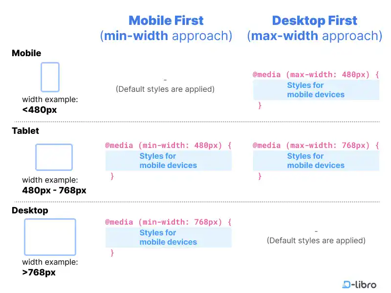
- CSS Media Queries: Media queries allow you to apply specific styles based on device characteristics, such as screen width or orientation. This technique ensures layouts adjust smoothly for various devices, making content accessible and easy to navigate.
- Flexible Grids and Layouts: Responsive design often begins with flexible grids that adapt proportionally to screen size, allowing elements to resize without breaking the layout. Using CSS properties like percentages for width and fluid grid systems helps ensure layouts remain stable and visually consistent on any device.
- Responsive Images and Media: Ensuring that images and media adjust to screen size is essential for performance and appearance. By setting maximum width constraints or using responsive image techniques, media can resize or change resolution as needed, optimizing load times and user experience.
- Scalable Typography and Spacing: Text and spacing are critical for readability and aesthetics. Responsive typography adjusts font sizes based on screen size to maintain legibility, while scalable spacing helps keep content organized and visually balanced across devices.
Together, these techniques form the foundation of responsive design, helping to create adaptable websites that maintain a cohesive look and feel. By combining these approaches, developers can build sites that not only look great but also perform effectively across all devices. This chapter will guide you through the process of implementing each of these techniques to build a truly responsive website.
What We Cover in This Chapter
In this chapter, we’ll explore the power of CSS media queries and techniques for building responsive websites that adapt across devices. The following topics are covered in this chapter.
- CSS Media Queries: A Comprehensive Guide to Responsive Design
- Responsive Design Example: Two Column Layout
- Responsive Design Example: CSS Display Grid
- CSS Calc() Function for Responsive Design
Here is the summary of this chapter.
CSS Media Queries: A Comprehensive Guide to Responsive Design
CSS media queries are foundational for responsive design, enabling developers to set style rules that adjust according to device features such as screen width, orientation, and resolution. This section explains the purpose of media queries, common syntax, and how they support adaptable layouts for all screen types. By mastering media queries, developers can make websites functional and visually pleasing across desktops, tablets, and mobile devices.
Responsive Design Example: Two Column Layout
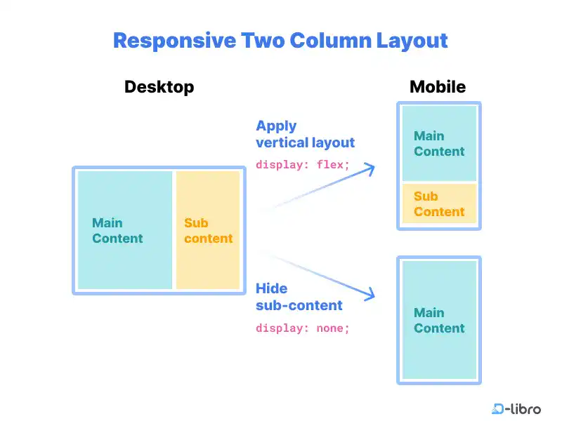
This example introduces a two-column layout approach using both Flexbox and media queries to adapt the design for different devices. Flexbox helps distribute content in a responsive two-column layout, adjusting from side-by-side alignment on larger screens to stacked alignment on smaller ones. By understanding this layout, developers gain skills for creating flexible and visually balanced designs suitable for a wide range of screen sizes.
Responsive Design Example: CSS Display Grid
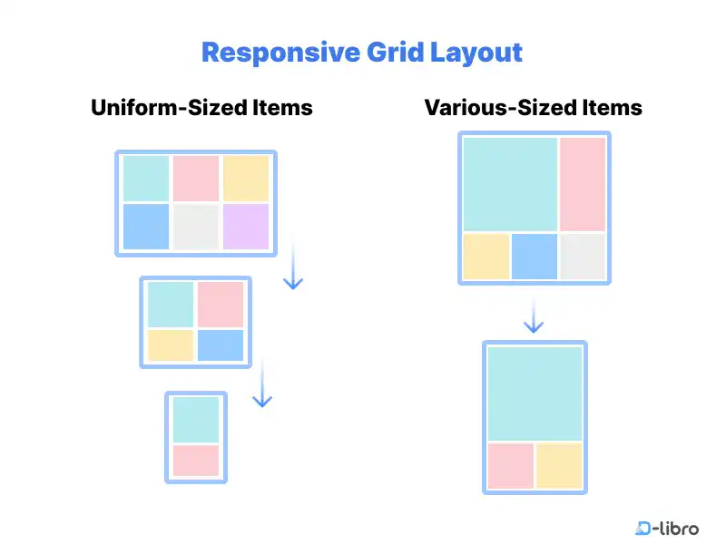
CSS Display Grid offers control
over two-dimensional layouts, making it ideal for more complex responsive
designs. This section covers how to create flexible grid-based layouts that
automatically adapt to various devices, using properties such as grid-template-columns and grid-gap. With CSS Grid, developers can create structured layouts that maintain
visual coherence and usability, even on smaller screens.
CSS Calc() Function for Responsive Design
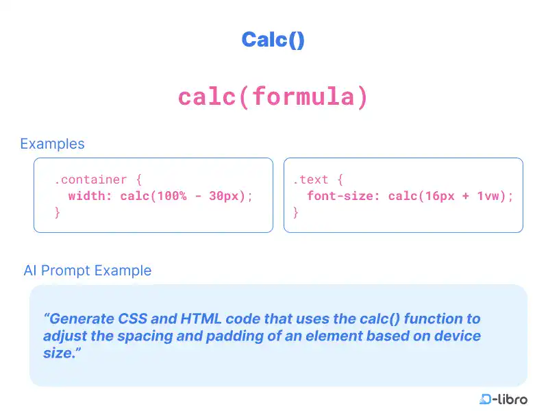
The CSS calc()
function enables dynamic, responsive layouts by allowing arithmetic
calculations directly within CSS. This function is helpful for combining fixed
and relative measurements to create adaptable designs. In this section, you’ll
learn practical applications of calc() for spacing, sizing, and positioning
elements in responsive layouts, helping you achieve greater precision in your
designs.


