Create Gradient Graphic: AI as CSS Gradient Generator

Creating visually appealing gradient graphics can significantly enhance the aesthetics of your web design. Traditionally, gradients are achieved through CSS, but with the power of AI, generating complex and customized gradient graphics has become more efficient and accessible. In this guide, we'll explore how to use AI as a CSS gradient generator to create stunning gradient graphics for your web pages.
By the end of this guide, you'll be able to create linear, radial, and conic gradients using AI tools and CSS code. We’ll also walk you through real-world examples to help you understand how to make gradient CSS and apply it effectively on your projects.
In this section, we’ll cover the following topics:
- Introduction to Gradient Graphics in CSS
- Linear Gradient: Creating Smooth Color Transitions
- Radial Gradient: Circular and Elliptical Color Patterns
- Conic Gradient: Rotational Color Blending
Introduction to Gradient Graphics in CSS
What Are Gradient Graphics in CSS?
Gradient graphics in CSS are visual transitions between two or more colors that gradually fade into each other. Gradients are widely used in web design to create visually appealing backgrounds, buttons, and other elements. Gradients can be linear, radial, or conic, each offering unique possibilities for design.
Benefits of Using Gradient Graphics for Web Design
Using gradients enhances the visual appeal of websites by adding depth and texture. Gradients can help create smooth transitions between colors, draw attention to specific elements, and give a polished, professional look. In modern web design, gradients are a popular choice due to their versatility and aesthetic appeal.
Popular CSS Gradient Types
- Linear Gradient: Gradual color transition along a straight line.
- Radial Gradient: Circular or elliptical transition from a central point.
- Conic Gradient: Rotational transition, often used for creating spiral-like patterns.
Linear Gradient: Creating Smooth Color Transitions
How to Create a Linear Gradient
A linear gradient is created by defining the direction of the gradient and specifying the color stops. Here's a simple example:
background: linear-gradient(to right, #ff7e5f, #feb47b);
This CSS code creates a linear gradient that transitions from #ff7e5f to #feb47b from left to right.
Preparing for Practice Files
This course takes a hands-on approach, allowing you to apply the techniques covered in real-world scenarios. We'll be using a structured folder layout. Before proceeding with the examples, please ensure the following files are prepared:
/your-project-folder/
    ├── 03-06-create-gradient-graphic/
        ├── example-1.css
        ├── example-1.html
        ├── example-2.css
        ├── example-2.html
        ├── example-3.css
        ├── example-3.html
        ├── example-4.css
        ├── example-4.html
For your convenience, these files are also available on our GitHub repository. You can download the practice files to follow along with the case studies presented in this guide.
AI Case 1: Create a Linear Gradient with AI
With AI, you can simplify the process of generating CSS code for linear gradients. Here's how to create a linear gradient using AI.
Sample AI prompt:
Generate CSS for a linear gradient that transitions from light blue to dark blue at a 45-degree angle.
Sample code output:
<!DOCTYPE html>
<html lang="en">
  <head>
    <meta charset="UTF-8" />
    <meta name="viewport" content="width=device-width, initial-scale=1.0" />
    <title>Linear Gradient Example</title>
    <link rel="stylesheet" href="example-1.css" />
  </head>
  <body>
    <div class="gradient-box"></div>
  </body>
</html>
.gradient-box {
  width: 100%;
  height: 300px;
  background: linear-gradient(45deg, lightblue, darkblue);
}
Instructions to see the results:
- Save the provided HTML code into a file named
example-1.htmland the CSS code intoexample-1.css. - Open
example-1.htmlin your web browser to view the linear gradient transitioning from light blue to dark blue at a 45-degree angle.

Visit this link to see how it looks in your web browser.
Radial Gradient: Circular and Elliptical Color Patterns
How to Create a Radial Gradient
A radial gradient radiates outwards from a central point, creating a circular or elliptical color transition. Here's a basic example:
background: radial-gradient(circle, #ff7e5f, #feb47b);
This CSS code creates a circular radial gradient that transitions from #ff7e5f to #feb47b.
AI Case 2: Create a Radial Gradient with AI
With AI, you can create complex radial gradients easily. Here's an example using AI.
Sample AI prompt:
Generate CSS for a radial gradient transitioning from red to orange in a circular shape.
Sample code output:
<!DOCTYPE html>
<html lang="en">
  <head>
    <meta charset="UTF-8" />
    <meta name="viewport" content="width=device-width, initial-scale=1.0" />
    <title>Radial Gradient Example</title>
    <link rel="stylesheet" href="example-2.css" />
  </head>
  <body>
    <div class="gradient-box"></div>
  </body>
</html>
.gradient-box {
  width: 100%;
  height: 300px;
  background: radial-gradient(circle, red, orange);
}
Instructions to see the results:
- Save the provided HTML code into a file named
example-2.htmland the CSS code intoexample-2.css. - Open
example-2.htmlin your web browser to view the radial gradient transitioning from red to orange.

Visit this link to see how it looks in your web browser.
Conic Gradient: Rotational Color Blending
How to Create a Conic Gradient
A conic gradient creates a color transition that rotates around a central point. Here's an example:
background: conic-gradient(from 0deg, red, yellow, green, blue);
This CSS code generates a conic gradient that rotates colors from red to yellow, green, and blue.
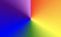
AI Case 3: Create a Conic Gradient with AI (Rainbow Colors)
Sample AI prompt:
Generate CSS for a conic gradient with rainbow colors starting from 0 degrees.
Sample code output:
<!DOCTYPE html>
<html lang="en">
  <head>
    <meta charset="UTF-8" />
    <meta name="viewport" content="width=device-width, initial-scale=1.0" />
    <title>Conic Gradient Example - Rainbow</title>
    <link rel="stylesheet" href="example-3.css" />
  </head>
  <body>
    <div class="gradient-box"></div>
  </body>
</html>
.gradient-box {
  width: 100%;
  height: 300px;
  background: conic-gradient(
    from 0deg,
    red,
    orange,
    yellow,
    green,
    blue,
    indigo,
    violet
  );
}
Instructions to see the results:
- Save the provided HTML code into a file named
example-3.htmland the CSS code intoexample-3.css. - Open
example-3.htmlin your web browser to view the rainbow-colored conic gradient.

Visit this link to see how it looks in your web browser.
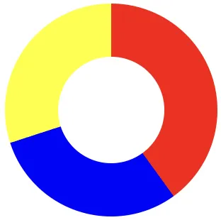
AI Case 4: Create a Donut Chart with Conic Gradient Using AI
Sample AI prompt:
Generate CSS for a donut chart using a conic gradient with three segments: 40% red, 30% blue, and 30% yellow, with a transparent center.
Sample code output:
<!DOCTYPE html>
<html lang="en">
  <head>
    <meta charset="UTF-8" />
    <meta name="viewport" content="width=device-width, initial-scale=1.0" />
    <title>Donut Chart Example</title>
    <link rel="stylesheet" href="example-4.css" />
  </head>
  <body>
    <div class="donut-chart"></div>
  </body>
</html>
.donut-chart {
  width: 300px;
  height: 300px;
  border-radius: 50%;
  background: conic-gradient(red 0% 40%, blue 40% 70%, yellow 70% 100%);
  position: relative;
}

.donut-chart::before {
  content: "";
  position: absolute;
  top: 50%;
  left: 50%;
  transform: translate(-50%, -50%);
  width: 150px;
  height: 150px;
  border-radius: 50%;
  background-color: white; /* Or match the background color */
}
Instructions to see the results:
- Save the provided HTML code into a file named
example-4.htmland the CSS code intoexample-4.css. - Open
example-4.htmlin your web browser to view the donut-shaped chart with red, blue, and yellow segments and a white center.

Visit this link to see how it looks in your web browser.
This guide has walked you through creating gradient graphics using AI tools, from linear to radial and conic gradients. By utilizing AI CSS gradient generators, you can streamline your design workflow and experiment with different gradient effects to enhance your web pages.
Best Practices for Creating Gradient Graphics with AI
Creating gradient graphics with AI and CSS can dramatically enhance web design by adding dynamic and smooth color transitions. Here are some best practices to follow when working with AI-generated gradient graphics.
- Choose the Right Gradient Type: Decide between linear, radial, or conic gradients based on the design needs. Linear gradients are ideal for smooth transitions, radial gradients emphasize central points, and conic gradients are perfect for rotational effects.
- Ensure Visual Harmony: Use complementary or analogous colors for gradients to create a visually pleasing and cohesive look. When using AI, prompt for colors that blend smoothly to avoid harsh transitions.
- Optimize CSS Code: AI-generated code can sometimes be verbose. Review and simplify CSS code to improve loading times and maintain cleaner code, which is especially important for large projects.
- Experiment with Angles and Positions: Gradients can be customized with various angles and starting points. Test different configurations in your design to find what enhances the layout best, especially for unique elements like background headers or buttons.
- Use Transparent Colors Wisely: Incorporate transparency for subtle gradients, which can add depth without overwhelming other page elements. For example, radial gradients with fading transparency can be useful for backgrounds.
Following these best practices will help you maximize the impact of AI-generated gradients, adding depth and sophistication to your web design projects. Each choice builds towards a visually cohesive, fast, and effective design.