Home (Landing) Page Development

The home page sometimes refers to the entire website, but it is usually defined as the first page in the website hierarchy. The index.html file is usually used for the home page. As the home page is the page users first land when reaching the website, it is also called a landing page, but 'landing page' can be used in a wider context, such as the first page of a web campaign page. On a home page or landing page, usually, a large cover image is often used to attract website users. There are particular CSS techniques to style this type of page.
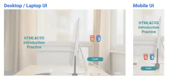
In this lesson, we'll use an example with the design structure in the main figure: a two-column structure on a desktop/laptop and a single-column structure on a mobile device. A website design that can change its layout automatically depending on screen size is called responsive design. There are several techniques to implement responsive design and we'll cover them in the next course in detail. In this lesson, we'll use a simple implementation example with the Flex Box layout.
The images below are the target design of the home page example.

We'll explain how to implement the target design of a home page using the following three steps.
- Sectioning
- Component position alignment
- Background cover image adjustment
1. Sectioning
First, we divide the screen into two sections horizontally at a 50:50 ratio. Then, further divide the second section into two sub-sections vertically at a 50:50 ratio.
This is the sectioning illustration for the desktop/laptop view.
Subscribe now for
uninterrupted access.