Nested Flex Box

A Flex Box can be nested by another Flex Box, and you can create a multi-layer nesting structure using Flex Box. This is a very helpful feature in website layout design.
Case 1: 3-layer nesting structure
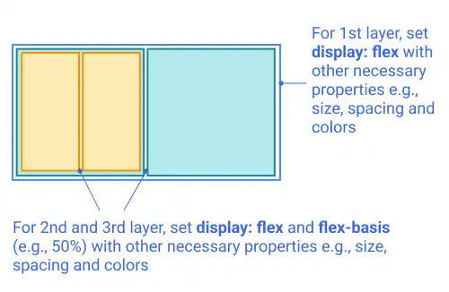
You can create a nested Flex Box by simply nesting a Flex Box under another Flex Box. If you don't specify flex-direction, the flex containers are horizontally separated like in the illustration below. To set the widths of nested containers, it is better to use flex-basis as it gives you the flexibility to change flex-direction later on. In the illustration, flex-basis for the nested containers is all 50%.

 Content position alignment
One of the major benefits of using Flex Box is to make content positioning easier. For example, if you want to put content (e.g., text) in the center of the 3rd layer container, you can set justify-content: center and align-items: center for the 3rd layer container element.
Subscribe now for
uninterrupted access.